Unlimited Revisions
Updates every 24 hours
Post-Project Support
Responsive Design
Pixel-perfect layouts that adapt beautifully to any device, ensuring a seamless experience everywhere.

Perfect on every screen
We design layouts that adapt gracefully to any device, ensuring clarity and usability across mobile, tablet, and desktop. Your website remains functional, elegant, and intuitive no matter how users access it. This consistency builds trust and improves engagement.
Mobile-first thinking
Our approach starts with the smallest screen to create focused, efficient interfaces that scale naturally upward. This ensures fast performance, easy navigation, and a polished experience everywhere. Users enjoy a seamless journey across all platforms.
Adaptive grids
Touch-friendly UI
Scalable typography
Performance-ready
Flexible layouts adjust intelligently to different screen sizes and orientations.
Same-day replies
Want to take this further?
Let's talk!
Let’s turn your goals into a clear plan and guide you through strategy, design and development.
Take your designs to next level

Trusted design and development for teams who value clarity, quality and long-term growth.

Unlimited Revisions
Updates every 24 hours
Responsive Design
Pixel-perfect layouts that adapt beautifully to any device, ensuring a seamless experience everywhere.
Perfect on every screen
We design layouts that adapt gracefully to any device, ensuring clarity and usability across mobile, tablet, and desktop. Your website remains functional, elegant, and intuitive no matter how users access it. This consistency builds trust and improves engagement.
Mobile-first thinking
Our approach starts with the smallest screen to create focused, efficient interfaces that scale naturally upward. This ensures fast performance, easy navigation, and a polished experience everywhere. Users enjoy a seamless journey across all platforms.
Adaptive grids
Touch-friendly UI
Scalable typography
Performance-ready
Flexible layouts adjust intelligently to different screen sizes and orientations.
Smart, user-focused services that help you move faster.
From concept to launch, we design and build what your product needs to grow.
Want to take this further?
Let's talk!
From new ideas to growing products, we help you design, build and scale clearly.
Same-day replies
Take your designs to next level
Trusted design and development for teams who value clarity, quality and long-term growth.
Unlimited Revisions
Updates every 24 hours
Responsive Design
Pixel-perfect layouts that adapt beautifully to any device, ensuring a seamless experience everywhere.
Perfect on every screen
We design layouts that adapt gracefully to any device, ensuring clarity and usability across mobile, tablet, and desktop. Your website remains functional, elegant, and intuitive no matter how users access it. This consistency builds trust and improves engagement.
Mobile-first thinking
Our approach starts with the smallest screen to create focused, efficient interfaces that scale naturally upward. This ensures fast performance, easy navigation, and a polished experience everywhere. Users enjoy a seamless journey across all platforms.
Adaptive grids
Touch-friendly UI
Scalable typography
Performance-ready
Flexible layouts adjust intelligently to different screen sizes and orientations.
Smart, user-focused services that help you move faster.
From concept to launch, we design and build what your product needs to grow.
Want to take this further?
Let's talk!
From new ideas to growing products, we help you design, build and scale clearly.
Same-day replies
Take your designs to next level

Trusted design and development for teams who value clarity, quality and growth.
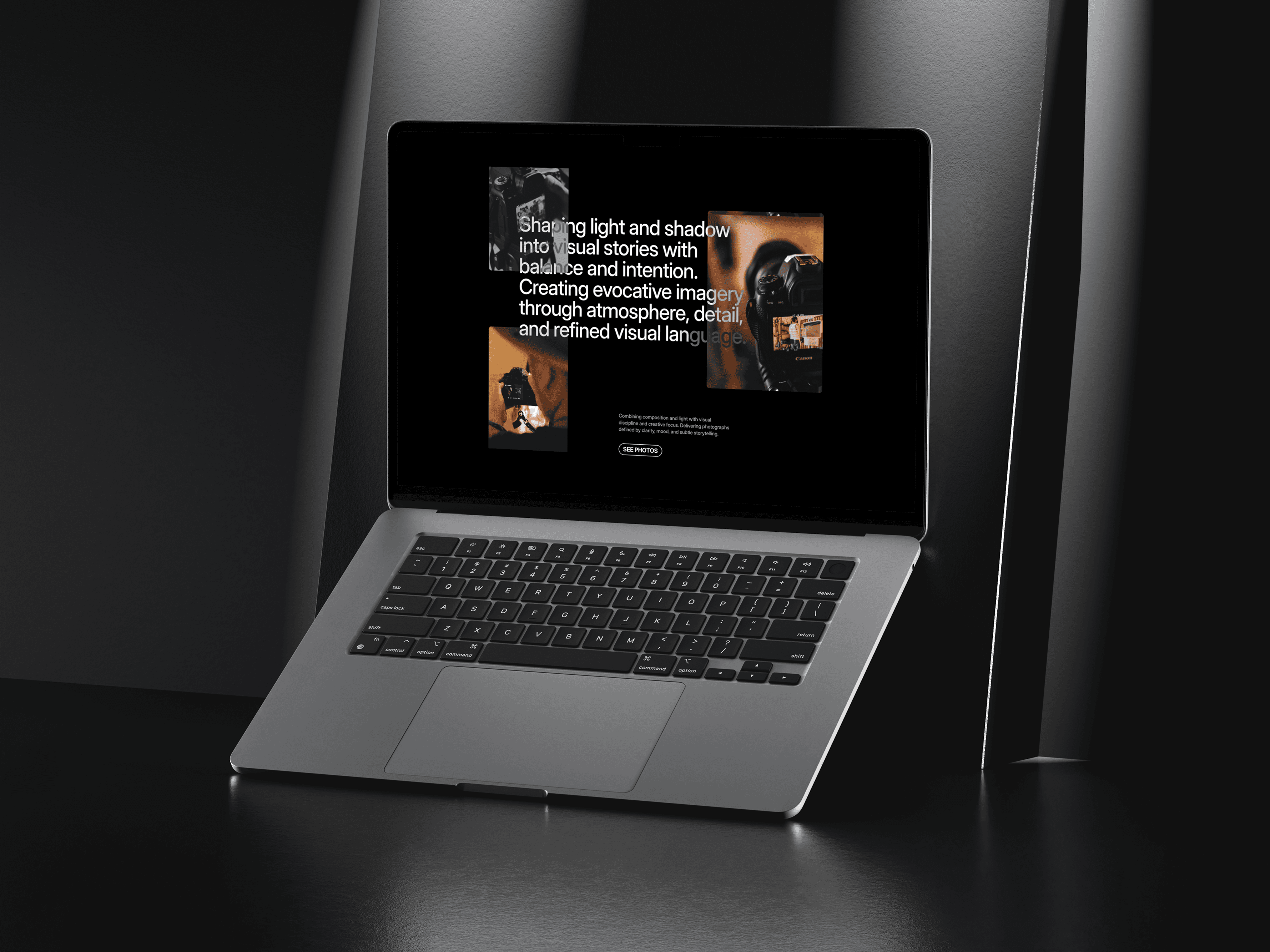
Featured projects